Brand Guidelines
The RailsBridge board commissioned a new logo and brand identity for RailsBridge in the spring of 2016. You can learn more about how it came to be in this very fun blog post!
The Logo
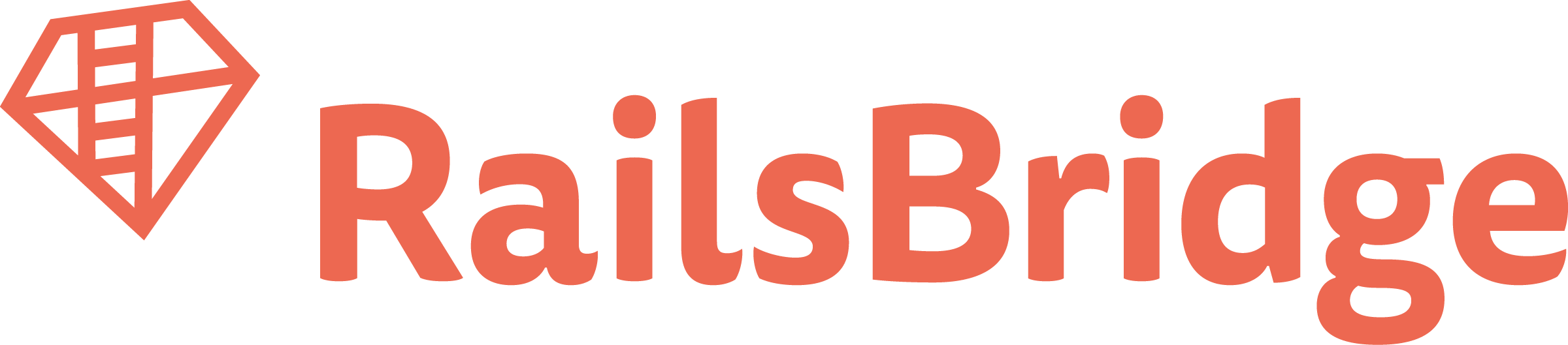
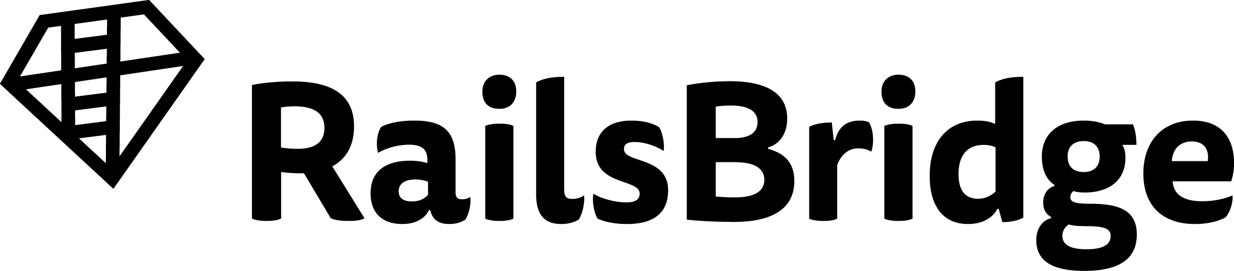
Here's our main logo as a .png in color and black and white:
You can also download all the permutations of the RailsBridge logo in one zip file from a Dropbox folder. It's about 18MB.
The full logo folder includes:
- The above logo in orange, black, and white (for use on dark backgrounds)
- The following file formats: .jpg, .png, .svg, .ai, and .eps
- A stacked version of the logo, with the RailsBridge ruby centered above the word RailsBridge, for use where a vertical logo fits better.
Chapter Logos
Please email hello@railsbridge.org if you'd like us to make a chapter-specific version of the logo for you! Here are some examples:
![]()
(Please do get in touch, rather than trying to make a chapter logo yourself! We've bought licenses for the fonts and are very excited to put them to use.)
Colors and Fonts
Our fonts are Tisa Sans Pro Regular and Bold.
The RailsBridge colors are mostly oranges and reds:
| #EB6852 | #B3282D | #831A27 |
Avoiding Common Mistakes
Good:
- RailsBridge as a single word
- RailsBridge with the "R" and the "B" capitalized
Bad:
- Rails Bridge with a space in the middle
- Railsbridge or railsbridge, without the "R" and the "B" capitalized